By the way, is it just me, or does the new PubReader format on NIH PubMedCentral totally kick butt? I can't help but wonder why journals have not gone to something like that. The best thing is that you can quickly glance at a figure–any figure–rapidly by just hovering quickly over the figure thumbnails at the bottom of the page. You read, see a reference to a figure, and can quickly take a peek (and then quickly come back). Why it took somebody 15 years to do something like this is anyone's guess, but I sure am grateful somebody finally did it.
Oh, and the best part is that it's open access! These are the free versions of the articles you have to submit to PubMedCentral.
Sunday, September 29, 2013
What's the point of figure legends?
Figures in journals have figure legends. But what's the point of these figure legends? In my mind, there is little point. At best, they can serve as a sort of "materials and methods" for the figure. But if people have to read something to actually make sense out of what's in the figure, then you've already lost the battle.
This happens all the time. Take a look at this figure.

Now in part C, there are some black data points and some red data points. What's the difference? What are the authors trying to tell you? Well, here's what the text is trying to tell me I should get from this figure:
To which the paper replies:
Here's another more biological example:

The paper tells you that
On a more general note, I think that sometimes authors approach their paper as "work" for the reader, that it's somehow good to struggle through a paper to understand it's meaning. Many biology papers with endless combinatorial gels have this quality, like one of those "If Harry can't sit next to Sally on Thursday but wants to sit next to Alice on Wednesday" kind of problems. I think that the notion that this is somehow "good medicine" is ridiculous. A scientific paper's goal is not to be the crossword in the Sunday Times. It's a vehicle for communicating results as clearly and quickly as possible. Our goal as authors is to achieve that result as best possible. It's not an easy task, but that's our job.
This happens all the time. Take a look at this figure.

Now in part C, there are some black data points and some red data points. What's the difference? What are the authors trying to tell you? Well, here's what the text is trying to tell me I should get from this figure:
As for other EAD sequences studied before, transactivation rises in a nonlinear manner with nY (Fig. 1C, red circles), demonstrating that multiple Ys act together in a cooperative manner.Okay, so the text is telling us to look at this figure to see some sort of non-linear phenomenon. Okay, but presumably these black things mean something also, right? Some sort of comparison? Wait, the legend must know!
To which the paper replies:
(C) Effect of Y number nY on transactivation and simulated binding. Relative transcriptional activity of the EAD peptides (open red circles) was determined under sub-saturating conditions (Methods and Text S1) relative to 10Yn activity (arbitrarily set to 100). Red error bars for the experimental data indicate SEM. The relative Pb(nY) values (filled black squares) are normalized by the Pb for 10Yn [nY = 10, actual simulated (absolute) Pb(10) = 0.43]. The black error bars mark standard deviations among ten independent simulations.Ouch. This highlights the problem with this format: the paper is telling me some relatively high level interpretation, then I look to the figure, but I can't make sense of it, so then I have to look at the legend, which is obfuscated to the point of utter incomprehensibility. Why would you make your reader work so hard?
Here's another more biological example:

The paper tells you that
Ectopic COT expression in A375 and SKMEL28 cells also conferred decreased sensitivity to the MEK inhibitors CI-1040 and AZD6244, suggesting that COT expression alone was sufficient to induce this phenotype (Fig. 4c, 4d, Supplementary Fig. 17).Hmm. Something about Ectopic COT expression. But I don't see any explanation of MEK1, or MEK1 DD (turns out they are negative and positive controls). In fact, just looking at this figure, I would have no idea that this was about overexpression whatsoever. Nor would I be able to tell what's going on with SKMEL28, which isn't even on here (probably in Supp. Fig. 17). And the legend gives us:
ERK phosphorylation in A375 expressing indicated ORFs following treatment with DMSO or 1µM of PLX4720, RAJ265, CI-1040 or AZD6244.Again, ouch! What are all of these different drugs doing? Which is the control (DMSO)? Which one inhibits what? What should I be drawing from this figure? This figure is a bit better than my other example, because the audience of the paper might actually have some notion of what this is all about due to common background knowledge, but the cognitive demands for understanding the point of this experiment for both the initiated and uninitiated are unreasonably high. Just imagine what a few simple annotations or diagrams could do here...
On a more general note, I think that sometimes authors approach their paper as "work" for the reader, that it's somehow good to struggle through a paper to understand it's meaning. Many biology papers with endless combinatorial gels have this quality, like one of those "If Harry can't sit next to Sally on Thursday but wants to sit next to Alice on Wednesday" kind of problems. I think that the notion that this is somehow "good medicine" is ridiculous. A scientific paper's goal is not to be the crossword in the Sunday Times. It's a vehicle for communicating results as clearly and quickly as possible. Our goal as authors is to achieve that result as best possible. It's not an easy task, but that's our job.
Monday, September 16, 2013
Images in presentations
Since Gautham is on the subject of presentation pet peeves, I thought I'd bring up one of my own (along with some solutions).
We do a lot of imaging in the lab, and one of the best things about it is that it can produce compelling images that are fun to show off at a talk. Nothing like a few oohs and aahs to bring the audience back from the dead...
But one thing that always bugs me in talks is the dreaded "Well, you can't really see it so well here, but trust me, it looks really good on my screen..." (and yes, it's happened to me many times). This is often accompanied by a valiant but typically doomed attempt to show the image on the laptop to someone in the audience to try and corroborate the claim. What are the common reasons that images look bad on the screen? Here are a couple along with some suggestions.
1. Image features are too small to see. We have a lot of RNA FISH images that we like to show off in talks. Which of course brings up a problem: the RNA spots are really small, and often we want to show off multiple cells. Or, even worse, comparisons between fields of cells. The temptation is to put those fields next to each other and shrink down the image. The problem then is that the images become so compressed that nobody can see the spots anyway. So then what's the point? If you have an image scale issue, one solution is to break the problem down. Show the outermost scale to get people oriented (along with markers that are actually visible at that scale), then show a little box around the area, and then zoom in.
2. Merges. Gautham covered this nicely. Merges usually just look really bad. Try not to use them. There are a few situations in which they can be useful, but they are rare.
3. Contrast is to low. This is actually an issue that's even more pronounced in print. The problem is that stuff that's obvious when you're sitting right next to your screen is hard to see on the projector. I think this is because when you are close up and have time to pay attention, it's easier to focus on what are actually rather subtle features in the image.
4. Settings on Apple Laptops
Here's another seemingly arcane but often crucial little trick. Despite my best efforts to adhere to the above rules, a few years ago I noticed that after I updated my laptop's OS, I found myself repeatedly saying "Well, somehow this isn't looking so good on the screen, but what you should see is..." Very embarrassing! And I just could not for the life of me figure out why my images were looking so crappy on the screen. Then, after some digging, I figured it out. Turns out that when you plug in a external projector (or monitor or whatever) to your Mac, it chooses a color profile for that device. This governs how the colors look on the screen. The issue is that a couple years back, Apple updated things so that the default color profile when you connect has terrible contrast for many images. The solution is to open "Displays" in System Preferences, then go over to the output screen, click on the "Color" tab, then uncheck the box marked "Show profiles for this display only", and then select "sRGB IEC61966-2.1". Anyway, after I did that, all those weird problems went away. But only after dealing with the first 3 items...
Time
I was in a shower at a hotel this morning, and I was wondering whether it was worth the time to put the cap back on the little bottle of shampoo after I used it, given that whoever cleaned the room afterwards would most likely just throw it away anyway. What if you added up all those little microseconds of wasted time in your life? It would probably add up to about as much time as it took to write this blog post... :)
Wednesday, September 11, 2013
A case against laser pointers for scientific presentation
- Gautham
Part 2 of a three part blog post. First part was on color merges. Perhaps there will be a third on 3d plots, which is the least pressing because it is the least common and the least damaging.
Laser pointers are the most common, and they invariably make for a poorer presentation than without it. Here are the three fundamental problems with the use of laser pointers in talks.
So what are good pointing devices to use?
Part 2 of a three part blog post. First part was on color merges. Perhaps there will be a third on 3d plots, which is the least pressing because it is the least common and the least damaging.
Laser pointers are the most common, and they invariably make for a poorer presentation than without it. Here are the three fundamental problems with the use of laser pointers in talks.
- Laser pointers do not point at things, they point on things. In fact, the term "laser pointer" is a misnomer. It is just a laser point. It does not produce a pointer, such as an arrow or a pointing hand. To highlight a feature with the laser you must overlap it with your extremely bright laser point, completely obscuring the feature as well as readjusting your eye's dynamic range to make the actual features on the slide harder to see. Laser pointer companies pride themselves in outdoing each other with brightness, and audiences are impressed by green laser pointers, the most distracting of all. This is missing the ... "point". When attempting to highlight punctate features the problem finds its ultimate aggravation (and don't get me started when laser pointing on color-merged puncta. Save our souls!). When a laser pointer is activated, its dot is invariably the brightest thing for your eye to look at. In summary, if you use a laser pointer, we in the audience see the laser dot. Not the thing you want us to see.
- The laser pointer is the only moving thing in our field of view. Suppose you were looking at a completely stationary picture and something moves in it. We are going to pay attention to the part that moves, not the part that sits still. Otherwise we have to use extreme concentration to suppress our instinct to focus on the stationary medium-intensity background instead of the in-motion brightly colored laser spot. In doing so, we are attempting to suppress an evolved instinct that saved our ancestors' necks countless times. This is another reason why when a presenter uses a laser pointer, we focus on the laser point, not whatever it is he/she is trying to point at.
- A laser pointer fosters the detachment of the presenter from the presentation. This is unfortunately the standard presentation mode by the entire community without anyone ever having made a conscious choice about it and has broader sources than just laser pointers. The modern scientific talk has turned into a kind of slide-cast where we all look at the slides and listen to the disembodied voice of the presenter. The two are sporadically connected by a device that projects an unseen beam ending in a bright dot. When a presenter wants to point at a feature, he/she will often step back from the presentation, further increasing the detachment. Is that how you want to learn? From a slide or from a person? Would you be happy if that's how your kids got taught in school? Do you want a talk where the slides are an aid and extension of the presenter, or one in which the presenter's role is to provide commentary on slides? I decided many years ago that scientists are more interesting that powerpoints, so if a presenter forces me to pick between looking at the slides and looking at them (which most do), I always look at them and mostly ignore whatever is projected.
So what are good pointing devices to use?
- Your hand. Best pointing device invented. Unlike the laser pointer, you can point at stuff with this, not just on stuff. Walk into your slide if necessary. It is your helper, not the other way around. Stay connected to it.
- A stick. Another classic pointing device. It extends your hand nicely to get to some of those plots you put at the top of your slide.
- Arrows in the presentation. If you can't do the first two, which may be if you have to talk in an enormous lecture hall and your podium has been unwisely (but commonly) placed far from the projection screens, you can animate an arrow to appear on your slide when you want to call attention to something. This requires you to think beforehand about what you want to call attention to.
What is a good use of a laser pointer?
Turns out they make passable lasers for optical applications. You can use them to align your complicated optical experiment, or even do fluorescence microscopy (I've used them for both). It is also apparently the case that the laser dot is very entertaining to cats and they chase after it like it is prey, which coming to think of it is a lot like what we humans do (points 1 and 2 above), so they sell these pointers at pet stores. Unlike humans, though, my brother reports that his cat eventually tired of the novelty.
Monday, September 9, 2013
A case against color-merges to show colocalization
- Gautham
Seeing as a recent post has revealed to the public my distaste for certain common scientific data display and presentation techniques (laser pointers, 3d plots and color-merges), it seemed a good time to explain why I'm not into these things. The color-merge comes first. I'll explain why I think it is a too-clever trick that is best replaced with showing each image separately.
It is often intended to show that signals in two different imaging channels, usually two fluorescent dyes or proteins, arise from the same underlying objects, or "colocalize." Scientists commonly find it necessary to take the two images, invariably collected in black and white, false-color them and superimpose them using some form of color-combining (usually an additive color model). Then you show a figure where you say that A and B where false colored red and green and look, in the combination all the features are purple. Or is it orange? Actually, what is the sum of red and green? Or are we subtracting red and blue from white? Isn't red plus green black?
I think this is the root of the problem with color merging for co-localization. We have no innate skill at combining colors. I have to look up a color wheel, or remember my elementary school painting class, to determine what the combination of two colors is supposed to be. Take a look at the wikipedia page for http://en.wikipedia.org/wiki/Cmyk and ask yourself if you get any idea for the full color print by looking at the CMYK decomposition. Aside from painting, when do we ever combine colors? When did our ancestors' lives or reproductive potential depend on their ability to sum red and green?
On the other hand, we are good at recognizing visualizing patterns. We do so innately and struggle to program a computer to match our capabilities. We can recognize a person's face in a caricature or in a minimalist hand drawing or despite considerable digital distortion and no matter what else is in the background. When two images are images of the same thing, we can tell. Plus, there is no need for chromatic-shift correction to make the point.
A corollary of these arguments is that color-merging is actually not too bad at showing lack of colocalization or simply to overlay two totally different types of images. For example, if you show diffuse immunofluorescence in one color and punctate RNA-FISH in another color and add them up. This does not demand that we add colors, and is a useful help for us to judge the spatial relationships between these two stains. It is analogous to having a foreground and a background in a picture. You can also color-merge two different punctate signals that do not co-localize and not do much harm (though it may be a wasted effort).
In short, if it can be avoided, don't require us to add colors.
Here are some other things that are sacrificed when color merging:
- For a co-localization merge, it is difficult to deal with the background and the signal in each image in a consistent way and still deliver your message. Unless the two images are linear transformations of each other, it will be impossible for the whole co-localized image to be the same color, despite perfect co-localization of the signal.
- Co-localization merge requires that not only the positions of the features be the same but that the ratio of intensities of the features in the two channels be always the same. It is quite difficult to know if a little bit of red has been added to green.
- You give up the freedom to independently contrast and colormap your separate images, which is very important when dealing with data that contains features at widely different intensities. You can then use color very effectively to encode intensity within each channel's image, and let our ample pattern recognition capabilities judge the overlap between channels.
Sunday, September 8, 2013
Courage in education
I just read an interesting article on NYTimes.com about supporting and encouraging women at Harvard Business School through a series of somewhat radical changes. These changes included what some of the naysayers called "social engineering" in order to create an environment more friendly to women (these mostly sounded good things to me). In the article, they profiled a woman who ended up giving the class's graduation speech. The theme of the speech was courage, and how much courage it takes to change things that are wrong. She particularly mentioned the courage of the one administrator, Ms. Frei, who took on the culture at Harvard Business School and decided to change it. Having read the article and considering the history and powerful interests I'm sure are at play at a place like Harvard Business School, I think that calling that move courageous is pretty accurate, and I think Ms. Frei's example is pretty inspiring. Another thing I took from the article is that real change usually involves pissing some people off. I'm wondering if maybe the trick is to know how to not to piss off just enough people that your ideas actually make it to reality.
Which led me to wonder where are areas in my job where I could be more courageous? I feel like in research, being courageous is sort of par for the course, since the whole point of any research project is to learn something that hopefully changes the way people think. (I think there are some places where a little courage could change how we communicate science... maybe in another post...) What about education, though? I think this is an area that is ripe for people being more courageous. I think that many people realize that the way we teach probably needs a fundamental overhaul–bottom line is that most students just aren't learning as much as they can or should. Doesn't it seem odd to you that we teach largely in the same way we have for the last several hundred years? Do we do anything the same way we did hundreds of years ago?
But change of the scale that at least I think we should engender will definitely piss off a lot of people, and will require someone courageous at the upper levels of university administration to implement/force down people's throats. You could imagine these sorts of things growing from the bottom up–i.e., from the faculty–but that has two problems: 1. even faculty who believe in this (like me) have so many demands on their time that we tend to largely revert to the default way of teaching; and 2. given that education is an endeavor that now typically occurs across departments, some sort of higher level coordination is needed.
Then again, maybe we don't have to wait that long. In research, especially in biology, I feel like changes in technology can force changes even upon those unwilling to accept them. Online education is perhaps just such a disruptive force. It's early, but I think it could be a chance to fundamentally reshape higher education. And it definitely pisses a lot of people off, which is a good sign... :)
Saturday, September 7, 2013
Rare Gautham sighting...
The sight of Gautham actually using a laser pointer was so bizarre that we had to record the event:
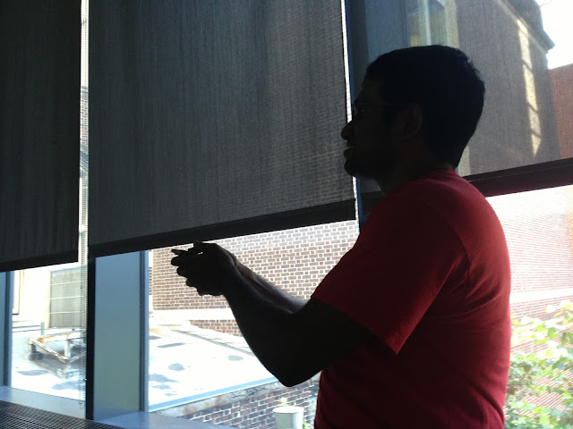
From group meeting yesterday. In other news, Gautham requested merged imaged channels and 3D plots. And reportedly said "Eh, statistical analysis, schmanalysis! Who needs that stuff, anyway." But you'll just have to take my word for it...

From group meeting yesterday. In other news, Gautham requested merged imaged channels and 3D plots. And reportedly said "Eh, statistical analysis, schmanalysis! Who needs that stuff, anyway." But you'll just have to take my word for it...
Subscribe to:
Posts (Atom)